Thursday, March 6, 2008

The future

Photobucket

This painting came straight out of my head. I have not done that in a while and it is something I feel I should do more. Working from no visual references freed me up.
Photobucket
This painting took only two hours. I am starting to realize that I am a in the moment painter. My paintings reflect the mood I'm in. Since I'm moody my moods may only last a couple hours. To capture these moods I must work fast.
Photobucket
Photobucket

Don't Pass Go Don't Collect 200$

Photobucket

Thursday, February 28, 2008

Back to the Future

It's 5:30 and I am just getting of work. All day I have been contemplating what I was going to paint after work today. Well I can't seem to shake this future idea, so I am going to go with it. If you read the last post you may think it was a little crazy, a little out there. Well it is. The thing about trying to explain a painting with words, without the painting is that it's just words. It is like trying to explain a song with out the music just the lyrics. Imagine trying to explain a Fergy song, take Lady Lumps. Try to explain this without humming the tune or dancing or anything. It simply does not hold water on it's own......Not to say that that song holds water with the music playing but I hope you understand my point.

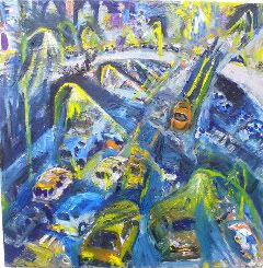
Well I'm gonna go for it, the Future Freeway painting. It has a nice ring to it.. I have painted so many freeways that I can look at a blank peace of paper and see a freeway on it without even the stroke of a pin. Because I see freeways, because they are imprinted into my head I feel I am ready to go for it with no visual references. That's right, right out of my head. This is why I am doing a future freeway instead of a normal freeway. I don't think I could actually depict a normal freeway without visual references but a future freeway I may have a chance at.

Trying to paint a future freeway is a lot like trying to describe a dream that you forgot.

This painting is a good exercise for me because it makes me create. It forces me to go some where I am afraid of. In painting something that does not exist I am stepping out of my comfort level. I feel as I did as a child jumping of the high dive for the first time. Scared but excited.

Tuesday, February 26, 2008

The Future

When did we get to the future. Well what I mean to say is that we don't look toward the future anymore as this place with men in tin foil suits. We don't have visions oi flying cars and floating city's in the sky. I think this is largely because we feel we are so advanced and that we are in the future. Or is it that we just grew up and those thoughts don't come up in everyday life. Well I don't know what the future holds as a race. Global Warming, a water world?.... Most theories I hear these days are negative, and perhaps they are correct. They do have evidence to back them up. Maybe humanity is going into a tailspin and soon it will be all over.
The sketch I did today did not reflect this negative vision, in fact it was the opposite. The sketch was of a positive outlook on a city in the future. It had a productive feel to it. I did not consciously come up with the idea, I just drew it. When I looked at it I wrote the future. Why was this sketch the future? Well everything looked different. The freeway seemed to have more cars on it. The buildings seemed to be the size of mountains. Something about this sketch was the same but different. So I went from sketch to painting (A small
one). My ideas of the future grew. I will upload the picture soon. But what if the future is a place where cars buildings and mountains grow. What if our knowledge allows us to create a living breathing world where houses build themselves. Some kind of Genetically engineered planet. Well I know it's not in these days to have a positive outlook on the future, nor a positive future for genetic engineering, but we have to be headed some where.

Sunday, February 24, 2008

Portrait of Kim Louie

I am currently working on a portrait of a good friend Kim Louie. The painting is in the early stages and so far I am happy with it. I am using red violet and green. As the painting stands now it is very green. The green is there for what it will become. I will add the red violet to the green, which will cause the green to dull it, will become almost no color. A color that is on the cusps between green and red violet. This is what I want because in the shadows of the face colors are very dull.

For the areas of the face illuminated by light I will not add the red violet because I don’t want the colors to dull. Instead, I will add orange and red. In doing this the greens will become brownish but keep there intensity. Then I can add white witch will create the fleshy color.

You may ask if I am changing the colors anyway then why start with green. Why not just mix the colors and apply them directly?
The green is the middle ground. While most of it will disappear it keeps the colors connected on a natural color spectrum. As darkness falls on a subject it not only gets darker but it loses saturation. I am tapping into an intensity spectrum that happens in nature.

Thank you Kim for posing you are doing a good job I am looking forward to the next session.

Sunday, February 17, 2008

How the west was Won


This painting is about Manifest Destiny and how it made the West as it is today.

Highway 280


Why was it painted?
I painted it because I felt i was ready to re-visit my visual obsession, crowded Urban Landscapes. This time I wanted to bring it home to San Francisco on a highway I drive, 280.

How long did it take?
11 hours.

What about the color palette?

Well this time I stared with Cobalt Violet and Cadmium Yellow. I started with these colors because they are contrasting and they are very bright. When you combine these together they get very dull. The Brighter they are the Harder the Dull. Using these colors makes it possible to achieve many tones quickly. Most of the painting was built up in these two colors. In the final hours I added some blues and and reds to cool it down and bring it back to earth.
What inspired this painting?

Excess, Crowded Malls, Oil Spills and NFL linebackers

Sunday, February 10, 2008

Elite Artist

I was at a very small art show in the gallery today. I was wearing what I paint in. My old work pants (Which ripped on my bike) and a t shirt. It's a large rip from the base to the knee of my pants. I was checking out the work and chatting it up a bit. There was an artist there who really had a problem with what I was wearing. I could tell he was talking about me with his group of Friends. Knowing this I confronted him. He made it a point to call me out on my pants. I explained to him that I was at my art studio in my paint outfit I told him how the pants ripped and that I wanted to make good use of them. He then questioned the length of the rip, How could they rip that far from catching a bike chain?, he asked. I explained to him that the rip was small but it has been getting bigger. I then explained in great detail exactly how the rip came to be. I thought it was very silly that I had to explain to him the that the rip was unintentional. I think he thought I was trying to make a statement with my clothes , and this statement that he thought I was making he did not like. Then he went on to ask me why I didn't put a safety pin on them. I then got frustrated with this guy. I explained again to him that I am at an art studio and That my image is the last thing that I care about here. I don't know if he had a problem with my leg hair Forrest or what. I then told him my penis is not showing, the rip only goes to my knee so whats the problem. Annoyed I left the gallery to go paint.


--
Anthony Papini
tonypapini.com

Wednesday, January 23, 2008

Self Portrait


This is my latest completed painting. It's a self portrait done from looking at a mirror. There is a lot going on in this painting but what is important to me now is the colors. I used blue green and red orange combinations for the face. I kept to the orange side of the spectrum but at times I did venture over to blue green. The background is red and green, the shirt is blue and orange. In each field of color I used the complement to dull the darks and shadows. The dark shadows on the shirt are actually created by adding orange to the blue. Overall I am happy with this painting. I like the intensity that is created by stroke and color contrast.

Sunday, January 13, 2008

The Death of Color


This painting is about the death of color. I find what happens with a sunset very interesting. As darkness comes the hue is sucked out of most color leaving dull browns and black. There is huge contrast created when yellow and orange sunlight pierces through the shadows. I was trying to achieve a balanced painting of dull and bright. I tried to suck the color out of anything that wasn't facing the sun. I did this by adding whites, complements, and black. When I felt the intensity levels for dull and bright were balanced the painting was finished.

For my next painting I want to try a self portrait. I plan to use red and green for my pigments. I plan to paint myself in my brown and yellow shirt. First I will cover the whole painting in red. I will add green and white to this red to get a brown and pink flesh. I hope to use these to these two colors to create a proper tone, value and intensity without having to mix in any other hue or black. This way the colors will appear to darken and dull naturally. I will be mixing other hues for my brown and yellow shirt, but I think that is pretty much it. While mixing the flesh it will be a challenge to keep the face from turning green,...it is important that I keep my mixtures on the red side of the spectrum.

Saturday, January 12, 2008

Just because I cant see a color does not mean that I can't determine if it's there.

The more I study color the more I understand the extant of my colorblindness. When I mix a color wheel I can distinguish all of the colors apart and name them except from blue-violet to blue. I can always distinguish a pure Violette. I can always distinguish a blue green. Any of the other pure colors on the color wheel I have no problem with. Sometimes if I add white to a blue Violette i can distinguish it from blue. (It should be noted that I can distinguish a pure blue most of the time but I am unsure if there is Violette in it. It's the blue I understand and the blue Violette my eyes are blind to). So does this mean that these are the only colors I get confused? No, Because blue Violette can be mixed into many colors. So this means any color that has blue Violette mixed in, I stand to get confused. There is a lot of colors out there that have Blue Violette mixed in them.
If what I said above is true then I still have some unanswered questions.
Why do I get brown and green mixed up ?( I have no problem with pure green and brown.) I get greens with a lot of black mixed in confused with dark browns. An example of this is in pine trees. When I was a young painter I would paint them brown.)
From what a understand about brown in that it is a muted color. It can come from many color combinations. I believe if you mix any complement into one color it will turn brown.( Blue and orange become brown) So why do I confuse a green Hue with Brown?

I have been finding out little tricks to identify color, I think it's interesting that a non-colorblind artist would never have the need to come up with these tricks. It's something about using these tricks that is exciting. Just because I can't see a color does not mean that I can't determine if it's there

Take blue violet for example. Lets say I dont know if it is blue Violette that i have mixed. Well it's true that my eyes will not allow me to see blue Violette but they will allow me to see it's compliment, yellow orange....A color that I can distinguish 100% of the time. So to see if I have really mixed a blue Violette I can add it to yellow orange. If the mixture turns black, then I have a blue Violette. This works on a palette but in nature I can't exactly grab a peace of the sunset add yellow Orange to it and see if it turns black........Or can I?
Monday, January 7, 2008

Yellow Orange and Blue Violet


It's amazing what you can do with two colors. I first covered the canvas with yellow orange. Then I painted the balloon and landscape in it's complement blue violet. When these color compliments are added together they complete the color spectrum. This means that all the primary colors meet. As a result the colors cancel each other out and become muted. It's great that you can get so many tones without adding black. I find it important that muting of color can create contrast in two colors that almost have the same tone. If you look at the river you see that it is very muted its almost becoming no color at all. This separates it from the blue Violet trees and the yellow orange background. I want to continue working this way. Next I want to use three colors that cobine to add black. This way I will have a whole rang of bright and dull colors.

Back to the Basics

Sunday, January 6, 2008


On Saturday (1/5/2008) I attempted to reproduce a Remington. Here is the results.

Parrot


This painting was an experiment in color. I was using new colors and I wanted to paint something saturated. I chose a parrot because they are very brilliant in color. The three colors I used were Magenta, Cobalt-Turquoise and Cadmium yellow. If i were to paint this again I would use a Pure Red. The Red in this painting was made by mixing Magenta Cadmium Yellow and black. most painters say mixing in black is a mistake. I agree with this sometimes. I feel that mixing black does desaturate a color but sometimes that is just what you want. For this painting however it was a pure rich red that I wanted and this cant be achieved by mixing hue. Also, I used tube black to mix in my colors. Tube black is cheap and it shows in this painting. In the future I am going to mix my blacks. I like to mix Phalo blue and Burt Sienna to get a cool black. For a warm Black I prefer Crimson and Phalo Green. I also need to be more concerned with the temperature of colors. This again can be achieved by not mixing blacks to get a darker tone of color. Dark-tone can be created by mixing a colors complement. I am going to attempt this in my next painting.

Monday, December 24, 2007

Lucy Moon


On July 17, 2007 Lucy Moon Papini made her grand entrance in Kamuela,Hawaii. She weighed 9.9 oz. and was 22" long. This painting honors her birth and is a gift to the Papini family.

Thursday, December 13, 2007

Painting of two birds, done on my lunch break.


I have been going to this park by my work for about two months now. The park is about 250 yards from giants stadium. I like to go to this park because it is peaceful, the scenery is nice and I enjoy watching the Birds. I usually eat facing the river so I can get a view of the seven or eight post that come out of the water. These post usually filled with birds of two types, Sea Gulls and Mud hens. One time there was a pelican but that was a special case. The birds on these post seem to be tired they don't move often. This makes them good candidates as models to paint from. Today was the first day in a long time that I painted on my lunch break. It was also the first time in a while that I have attempted a Plen Air painting. After eating my sandwich and drinking some water I had about 40 minutes to paint. I lost some more time because a man reported me to park security for riding my bark through the park. With time constraints I was required to be quick and loose. It was a productive paint lunch

Tuesday, December 11, 2007

Break through or break down

Breakthrough or Breakdown? As a painter sometimes it is hard to tell the difference between the two. These terms are difficult to distinguish because one is Positive and one in negative. I think at times a breakthrough may seem as a breakdown at first.

Tonight (12/11/2007) I worked for three hours in my studio on a painting that I have been working on for three to four weeks. Like many paintings that I work on for large amounts of time I have high expectations for the results. My thinking behind this is that you spend a lot of time and the results should show through. The more time spent, the better the result. This means that with a painting that takes a lot of time the artist has more pressure to produce a quality product. Nobody wants to spend three weeks on something and have nothing to show for it. Part of me feels like that is what happened tonight. I feel as if I was building a fence for for a month and today the wind blew over. This is the part of me that would consider what happened to me tonight a breakdown.
Another part of me well feels the opposite. It's written in my artist statement that a painter should not be concerned with the outcome of the painting. The reason I have this in my artist statement is to remind myself that a painting should be about the process. Tonight when I worked on the painting I changed course. I abandoned my original vision of the completed painting and forged new waters. I painted with feeling with bold color and emotion. I feel in painting this way I was setting a standard for paintings to come. I can consider tonight a breakthrough because I am now painting with energy again.
Tonight I was really thinking about how the painting process relates to life. While working on the painting I thought about my upbringing. I thought about how that the things that happened to me when I was younger never disappear. These memories and habits that I acquired are what made me who I am today. Throughout life good things and bad things happen to you. Some people are tuff because people bullied them when they were little. Some people have a lack of trust in people because people they cared about let them down. It's the experiences that affect us and the way we deal with them that shape us.
I thought of how this relates to my painting process. While I was painting I noticed the image that I was painting from had an orange spill on it. It was a paint drop that had landed on the image while I was painting. So I decided since I was painting from this image and it had an orange drop on it, then in my painting I would include the orange mark. So I did, I added an orange glaze to the painting. Then I decided I liked that so I added another paint drop to the image I was painting from and tried to reproduce that on the painting. I went a little overboard with this and before I new it my paint image and my painting had orange glazes all over the place. Now the painting was completely changed. Now that the painting was changed the question is how was I going to deal with it? If the painting changes for the better or worse that orange layer would never be obsolete, even if all the orange disappeared. That orange still effects the outcome of the painting. Just as in somebody's life who overcame a drug addiction or cancer. It may of may them stronger, or weaker. They may do a good job of hiding that it ever happened, but it is still there. It is exciting to think something good can come from everything. That is what the orange means to me.

Sunday, December 9, 2007

Finished


After 1 hour I finished it. I cleaned up some edges and in small fine lines I brought out distinct shapes. It always tricky finishing a painting.

I worked for about another hour and a half on it since the last post. I did a glaze of red/brown and reworked it. I like what happened, the colors have been dulled because of the glaze. I think it makes you're eyes rest easier.

Raging Bull


Raging Bull
Acrylic on Canvas
3'by3'
2005
If you have ever been to Santa Cruz this painting was at the Tampico Kitchen & Lounge, from 2005 to 2007. Then it was sold from the Lounge in the summer of 2007. I don't know where it is now but I hope it's on a wall.

I found this photo on a google search for Raging Bull.


"Raging Bull"
Gouache on Canvas Board
4" by 7"
12/9/2007
This painting is a revisit to a painting I did in the summer of 2005. It is not complete so stay plugged in for the finished product. In both paintings I used the same image to paint from. The painting I did in 2005 was 3'by 3' and this one is 4" by 7" I decided to work with the same photograph again because I loved that image then and I love that image now. I thought it would be interesting to see how I would render the painting different two years later.

I enjoy the subject matter of this painting. It is not that I am a huge fan of the run of the bulls in Spain. It's more of a visual reason that I am drawn to this image. I enjoy the energy of the big brown beast that takes up the foreground. I enjoy the emotions of the people running from the bull. I like how they position there bodies in unnatural positions to dodge the Bull.
I enjoy the architecture that is filled with people with different emotions than the bull runners. They are cheering and happy because their elevation protects them from the beast.

New Rooster Painting


"Jungle Rooster"
Gouache on Canvas Board
7"by5"


After working on a freeway painting for about three weeks I can not get the painting where I want it. I counted a hundred cars on that painting. This rooster is mostly a release for that freeway painting, a break from the gridlock. This painting took about two hours to complete. I painted it in stages. The painting sat on the table in the living room and I just worked on it when I had a few minutes to spare.